Beating the NBA Shot Clock and More: Exploratory Data Analysis Project
The shot clock is one of the most important features of an NBA game. During each possession, the team with the ball gets 24 seconds to attempt a field goal. If the shot clock expires, a turnover is committed and the opposing team gets possession of the ball. It may seem like a simple rule, but the shot clock has motivated all thirty NBA teams to employ various strategies to use the shot clock to their advantage. Some teams love to milk the shot clock, or use it all up. This gives the offensive team more time to run more elaborate plays and ultimately generate higher percentage shots. It can also disrupt the opposing team’s offensive flow, as they have to wait a long 24 seconds between their plays. Other teams like to push the fast break, or attempt a shot within the first few seconds of getting the ball. The intensity of a fast break can decimate even the best defenses. Which strategy is better? It may depend on the circumstance, but we can use data to analyze this intriguing issue. Furthermore, we can use the data to analyze shot percentages based on distance from the basket to determine the best type of shot to take at which time. Throughout the course of the project, I compared the NBA averages to Stephen Curry’s averages, arguably the best shooter in the league.
Data: I began with data on every single shot taken in the 2014–2015 NBA season. The data source is from Kaggle. The data initially consisted of 21 columns and 128,000 rows (now we know that about 128,000 shots are taken in an NBA season). I removed irrelevant columns that wouldn’t be of potential interest. The columns I ended up with were Shot Clock, Dribbles, Touch Time, Shot Distance, Closest Defender Distance, Player Name, and whether or not they made the field goal. I then cleaned up the data by dropping rows with missing values. I did this using pandas.
Some guiding questions:
- Are quick shots (16+ seconds on the shot clock) better than shots with the shot clock expiring?
- Is there a relation between the number of seconds remaining on the shot clock and how far the nearest defender is (quick shots usually are more open)
- Does Stephen Curry’s data follow roughly the same pattern as the average NBA player?

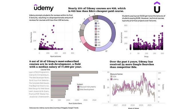
I first plotted a histogram mapping the distribution of shots over the 24 second shot clock period. The shots were roughly normally distributed, which shows that the average shot is taken with half the time on the shot clock remaining. As for whether a shot with 12 seconds left is better than 3 or 20, it remains to be seen.

To explore this issue, I created the same histogram this time separated by the number of made and missed shots. I also included Stephen Curry’s distribution on the right to compare. From a close inspection, it seems like shots with more time on the shot clock were generally higher percentage. However, it is still hard to see.
We can also see that Curry’s distribution is skewed to the left, meaning that he likes to take shots with more time on the shot clock. As a player who likes to run the fast break and take quick threes, it is somewhat unsurprising.


To make the correlation clear, I plotted the time remaining on the shot clock against the shot percentage. There is a clear positive correlation between the time remaining and the shot percentage of the average NBA player. Earlier shots tend to result in a better outcome. However, we should importantly note that correlation does not imply causation. Just because one takes a shot earlier does not necessarily mean that it will more likely go in. Some further analysis would confirm that causation is indeed questionable.
Also, we note that Stephen Curry’s percentages are rather abnormal and do not follow the trend of the average NBA. He shot a blazing 60% with 3 to 6 seconds left on the shot clock. Well, you can’t expect the greatest shooter in the league to follow the norm all the time.


By including the distance to the closest defender, an interesting observation comes to the surface. The outliers on the right side of the graph show that some shots taken within the first few seconds are completely uncontested. So uncontested that there are no defenders within 20 to 50 feet. It becomes obvious now that this is caused when the fast break outruns the defense and scores an easy basket. These free buckets no doubt raise the percentage of shots with more time remaining on the shot clock, shown in the previous two line plots.
I went on to analyze the NBA shots based on distance from the basket instead of time on the shot clock.


The results show that the most attempted shot are shots within 5 feet of the basket (in the paint) and shots about 25 feet from the basket (3 pointers). Stephen Curry’s favorite shot is unsurprisingly the 3 pointer.


By showing the field goal percentage (FG %), there is a clear downwards trend of FG % as the distance from the basket increases of the NBA. However, midrange shots are actually lower percentage than long midrange shots, which is surprising. Stephen Curry’s averages show somewhat the same trend, although his averages are markedly higher than the average NBA player. Additionally, his 3-point percentage is just out of this world.
Summary of Analysis
Overall, we saw that there is a slight positive correlation between shot percentage and remaining time on the shot clock, and a slight negative correlation between shot percentage distance from the the basket. The former was somewhat surprising while the latter was common sense.
However, through further analysis, we observed that the shot clock vs shot percentage was affected by shots with no defenders remaining. We predicted that these were caused by fast break points. Therefore, it is still unclear whether taking shots earlier result in a better average outcome. We must remove these outlier data points in order to make further conclusions.
We also observed that Stephen Curry’s distributions were usually similar to the average NBA player. However, he outperformed the NBA greatly in areas such as high-pressure shots with only a few seconds remaining on the shot clock and long distance shots.
Further Research
Removing the outliers observed in this research project is one of many different ways to explore the shot clock deeper. We could also gather data on the different types of plays teams run based on the time remaining on the shot clock when they are given possession of the ball, and the success rate of those plays.